Case Study 02
KeelLearn Portal — Testing Usability Before Learners Drop Off
A pilot usability study that surfaced systemic failures before Phase 1 launch.
Research Process
The Problem
KeelLearn needed confidence that first-time LMS users could navigate lessons, understand content, and use features — before the platform shipped to Phase 1 volunteers. Without a usability baseline, the team risked onboarding learners into a confusing experience that could silently suppress activation and completion.
I designed a moderated remote pilot study to get ahead of those failures — using Keelworks employees as proxy testers to simulate the first-learner experience on the live production site.
Research Design
I ran around 22 tasks across four research questions — navigation, retention, feature interactions, and accessibility. Each session included a structured observer using a consistent notetaking protocol. Sessions were 40–45 minutes, moderated remotely. I pre-registered hypotheses and defined success criteria before testing began.
The study was structured in four sections: navigation tasks (A1–A7) to test whether participants could move through modules and lessons independently; retention tasks (B1–B5) to assess comprehension and recall; feature interaction tasks (C1–C5) to test discoverability of bookmarking, progress tracking, and discussions; and a passive accessibility audit (D1–D9) conducted by the observer throughout.
Moderator Protocol
I wrote the full moderator guide for this study — covering pre-session tech setup, consent language, task scripts, and structured observer notes. Below is an excerpt from the task script showing how tasks were designed to surface specific failure modes without priming participants.
"You've just logged in. Without any help, find Module 1 and open the first lesson."
— Task A1 (Navigation). Watch for: Do they use the left sidebar or scroll the main area? Do they understand lesson numbering?
"Can you show me where you would go to complete the discussion activity for this lesson?"
— Task B5 (Retention). No link provided. Note every reaction. After: ask whether they knew where the discussion button was before this test.
"Now, can you navigate to lesson 2.2? Please skim through this section… On a scale of 1 to 5, where 1 is 'effortless' and 5 is 'took a lot of mental energy,' how would you rate reading this section?"
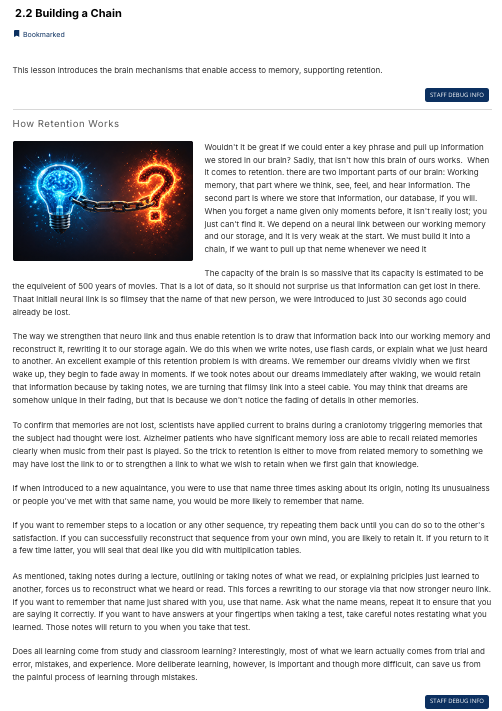
— Task B3 (Retention). Watch for: 8 dense paragraphs, no subheadings. Time them; watch for skim vs. linear reading.
Tasks were read verbatim with no paraphrasing or hints. Each session ended with wrap-up questions on overall confidence, ease, difficulty, and accessibility — including a direct question about font size and contrast that fed into the accessibility findings.
Platform Overview
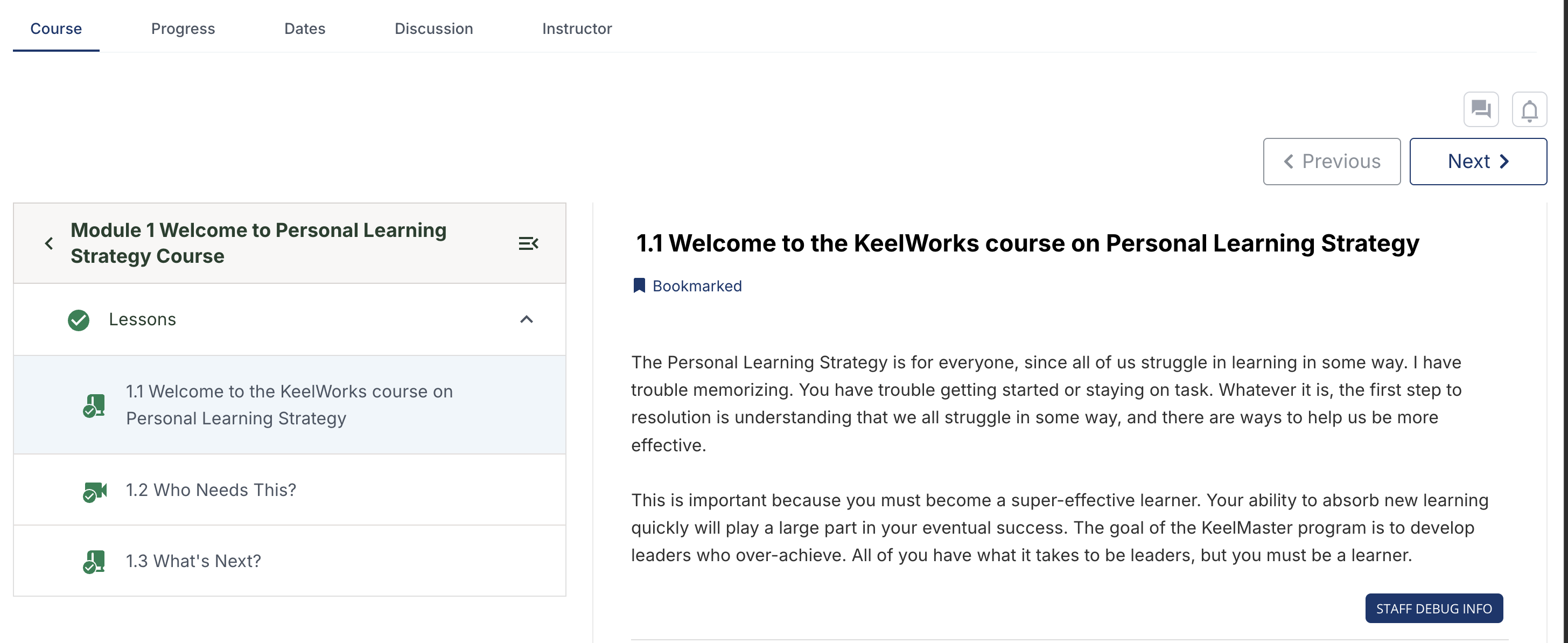
Screenshots from the live KeelLearn portal — tested on production before Phase 1 launch.

Key Findings
"Looking for a header or guidance at the beginning to locate discussion areas."
— Tony, Recruitment Lead
The discussion button lives in the top navigation — far from the assignment prompt that asks learners to use it. Users completing an assignment had to scroll back to the top and find a tab they hadn't noticed.

When entering a module, lessons do not auto-expand — users land on a blank-looking module page with no visible content until they click the dropdown. The expectation is that lessons appear automatically on module entry.

"Hover over the three lines — rollover, something should pop up."
— Therese, Instructional Designer
"Very hard to read…brains don't last this long. Break up sections into smaller portions — most people will stop reading."
— Therese, Instructional Designer
"This feels more like a book than a course. I'd replace the text scroll with infographics and mouseovers on terms like 'brain mechanisms' to define them in context."
— Robert, Program Manager
"'You may have trouble memorizing' feels like you're telling me I'm going to fail. Just say what I'll do, not what I might struggle with."
— Robert, Program Manager
Prioritized Recommendations
| Priority | Recommendation | Effort | Status |
|---|---|---|---|
| High | Auto-expand lessons dropdown when entering a module | Low | In Progress |
| High | Improve discussion discoverability — move button near assignments, add text label | Medium | In Progress |
| High | Fix progress circle icon — distinguish from loading state | Low | Won't Do |
| High | Add hover tooltips to all sidebar icons | Low | In Progress |
| High | Increase contrast on top nav tabs | Low | In Progress |
| Medium | Break up dense content with subheadings (especially Lesson 2.2) | High | Planned |
| Medium | Clarify assignment instructions; surface in lesson flow | Medium | Planned |
| Medium | Increase font size and line spacing across modules | Medium | In Progress |
| Low | Review image relevance throughout modules | Medium | Planned |
| Low | Fix typo in Lesson 2.2 title ("Rght Key") | Low | Planned |
| Medium | Add hover tooltips to in-lesson icons (discussion, bookmark, etc.) | Low | Planned |
| Medium | Rewrite presumptuous or passive lesson copy to active, learner-centered voice | Medium | Planned |
| Medium | Add infographics, callouts, and labeled figures to dense lessons (esp. Module 2) | High | Planned |
| Medium | Bold assignment section and add a distinguishing icon or label in lesson flow | Low | Planned |
| Low | Clarify or remove Discussion vs. Question toggle in the post form | Low | Planned |
| Low | Standardize image styling across modules (consistent drop shadow or border) | Low | Planned |
Note: The progress circle fix is marked "Won't Do" because the submodule level containing it is being removed entirely — a structural fix that resolves the issue at the source.
Impact
What I'd Do Differently
Four participants surfaced consistent usability patterns across navigation, content, and discoverability — but that sample size still isn't large enough to confidently rank severity or measure prevalence. With more time, I'd push to at least six participants and include actual target learners (particularly neurodiverse users, given KeelWorks' mission) rather than proxy testers from within the organization. I'd also add a short pre-study survey to capture baseline familiarity with LMS platforms, which would let me separate onboarding confusion from genuine platform usability failures. And ideally, I'd run a second round of testing post-fix to validate that the changes worked.
What's Next
The Keelworks team is currently applying fixes based on research findings across all four sessions. Several high-priority recommendations are already in progress — auto-expanding lessons, improving discussion discoverability, optimizing font size and line spacing, and adding sidebar tooltips. The progress circle issue was resolved structurally by removing the submodule level containing it. Robert's session (session 4) added new actionable signal around content language and visual design, which the team is now incorporating into a content style pass across all modules.
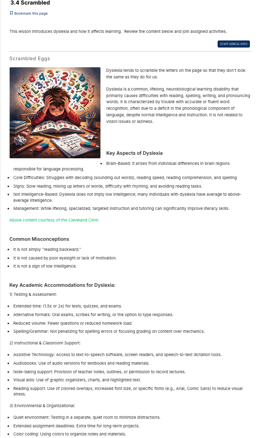
Next steps include validating fixes with real Phase 1 learners once implemented. Lesson 3.4 — restructured by Therese using her instructional design background — already demonstrates what better formatting looks like within the platform: subheadings, bullets, embedded images, and hyperlinked citations. That lesson is now a concrete internal benchmark the team can use to bring the rest of the module content up to the same standard, rather than addressing density issues lesson by lesson.