Case Study 01
PTSD Coach — Help in One Trip
Reducing cognitive load so veterans can access support, even in crisis.
Research Process
The Problem
PTSD affects millions of veterans and civilians. During a trauma response, cognitive capacity drops sharply — people can't parse complex navigation, remember where features live, or make multi-step decisions. The existing PTSD Coach app required exactly that.
The core research question: How do we get veterans to the right support as fast as possible, with as little friction as possible, even when they're in acute distress?
Research Approach
I used a mixed-methods approach to understand both the landscape and the lived experience.
- Interviews — In-depth sessions with veterans and clinicians to map mental models and identify breakdown moments in the current app.
- Surveys — Broader data collection on feature usage, drop-off patterns, and self-reported barriers during high-distress situations.
- Usability Testing — Task-based testing of existing and redesigned flows with attention to time-on-task and error rates.
User Research
Journey Mapping
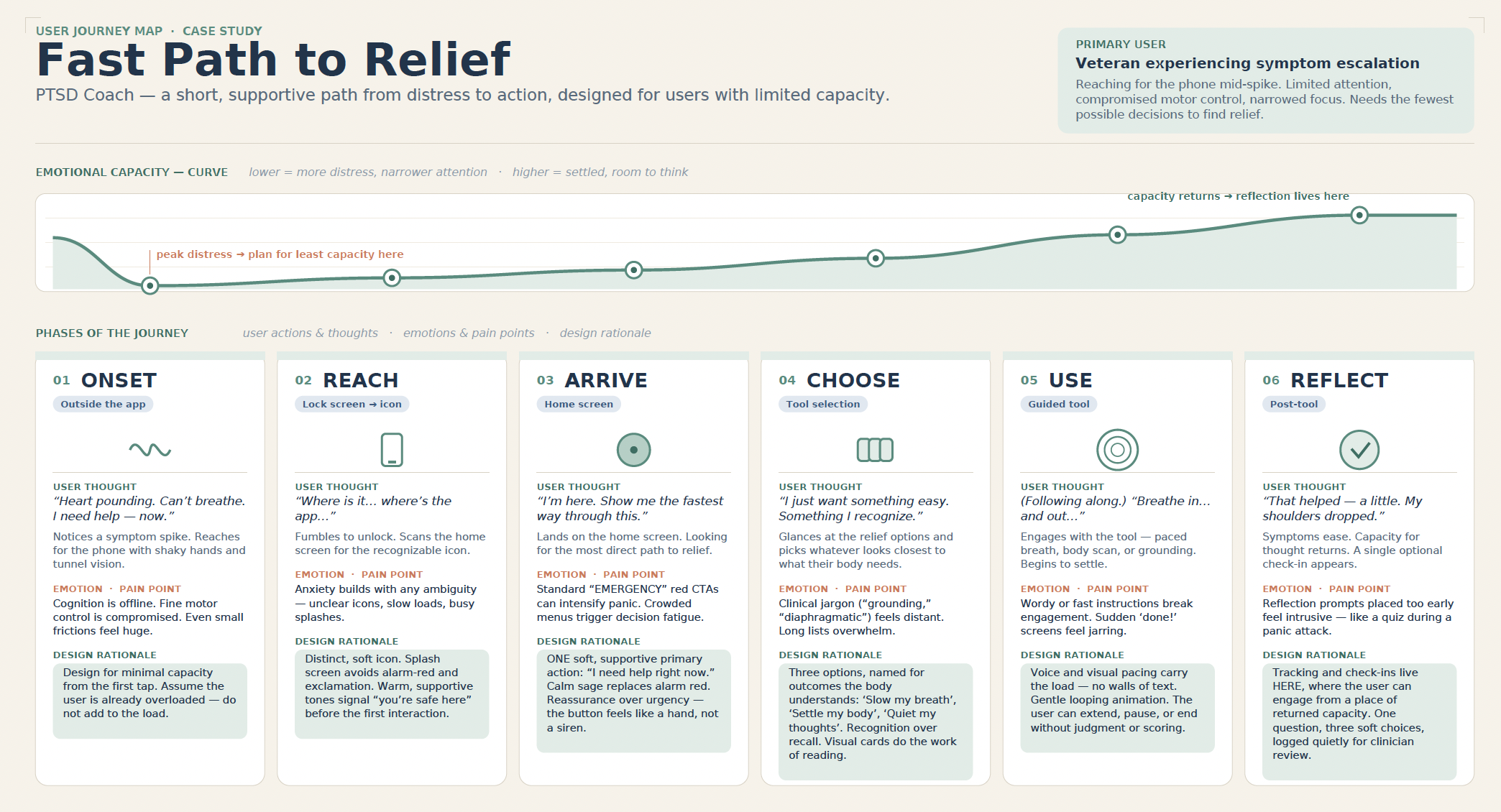
I mapped the full user journey from symptom onset to post-tool reflection, charting emotional capacity at each phase. The map made clear that the highest-friction design decisions were concentrated exactly where cognitive capacity was lowest.
Design Iterations
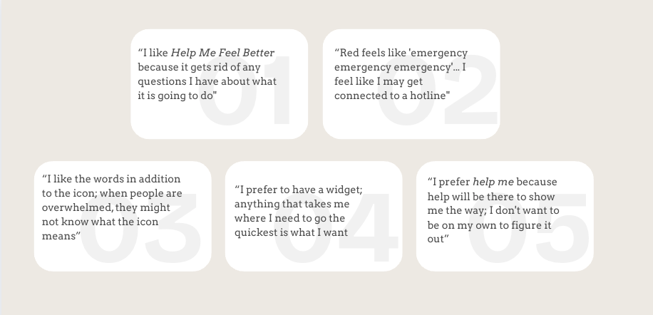
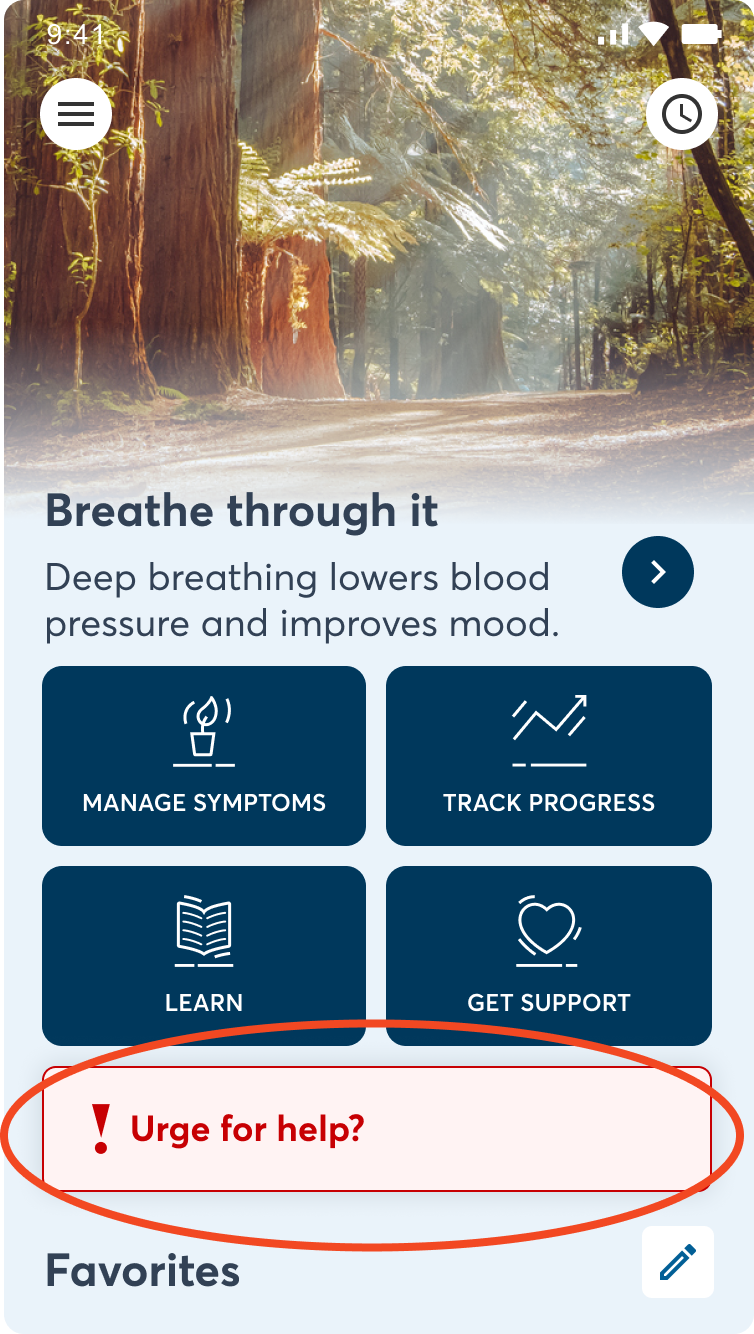
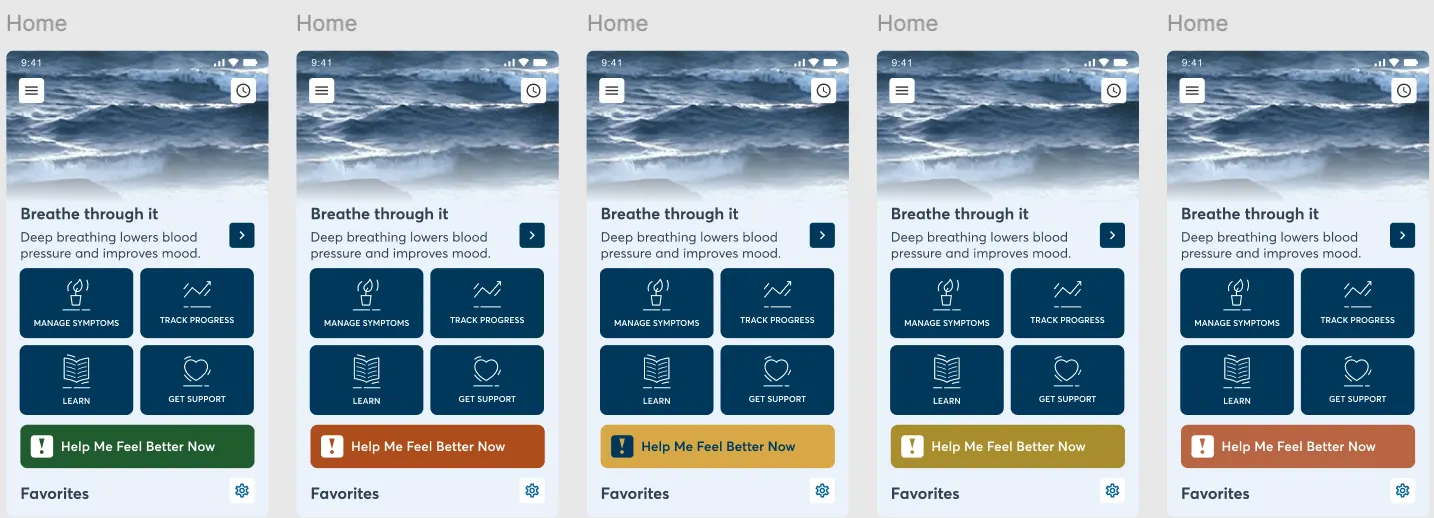
The most contested design decision was the primary emergency button — its label, color, and placement directly shaped how safe or alarming the app felt.
Solution
Drawing on Cognitive Load Theory, I led the redesign around one principle: when someone is suffering, every tap is a barrier.

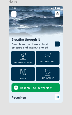
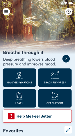
- "Help Me Feel Better Now" button — Persistent, warm-toned CTA always visible. One tap to crisis tools. Calm sage replaces alarm red.
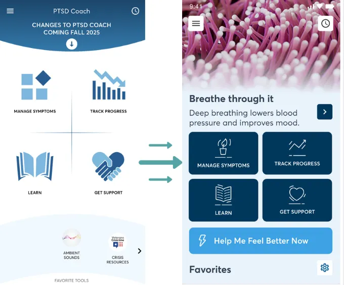
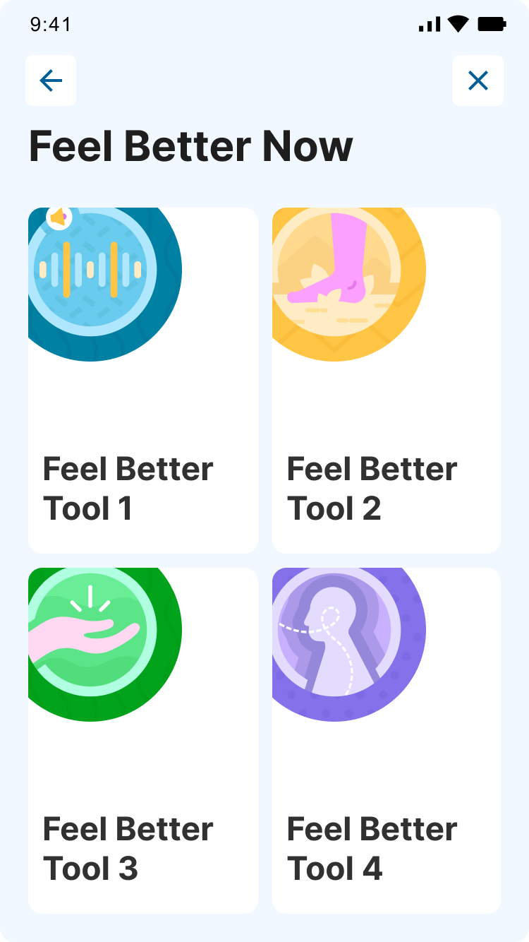
- Restructured home screen — Four clear, icon-labeled quadrants replace the previous cluttered menu structure.
- Calming visual context — Nature imagery replaces the clinical white background, signaling safety from the first interaction.
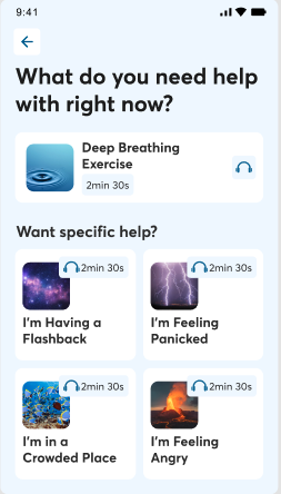
- Language-based tool selection — Users describe how they're feeling and are routed to the right tool without knowing its name.
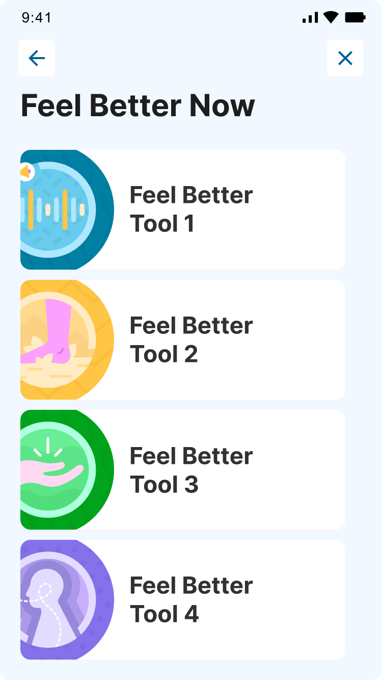
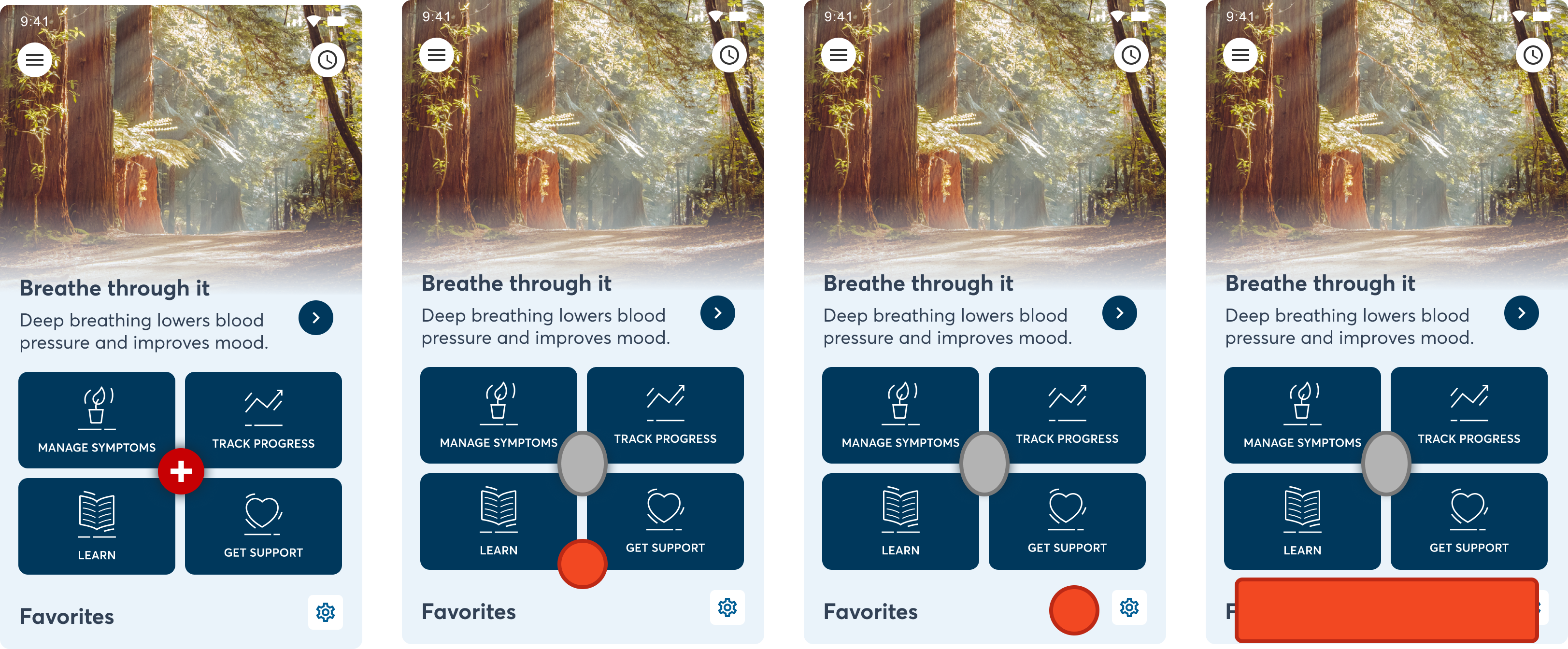
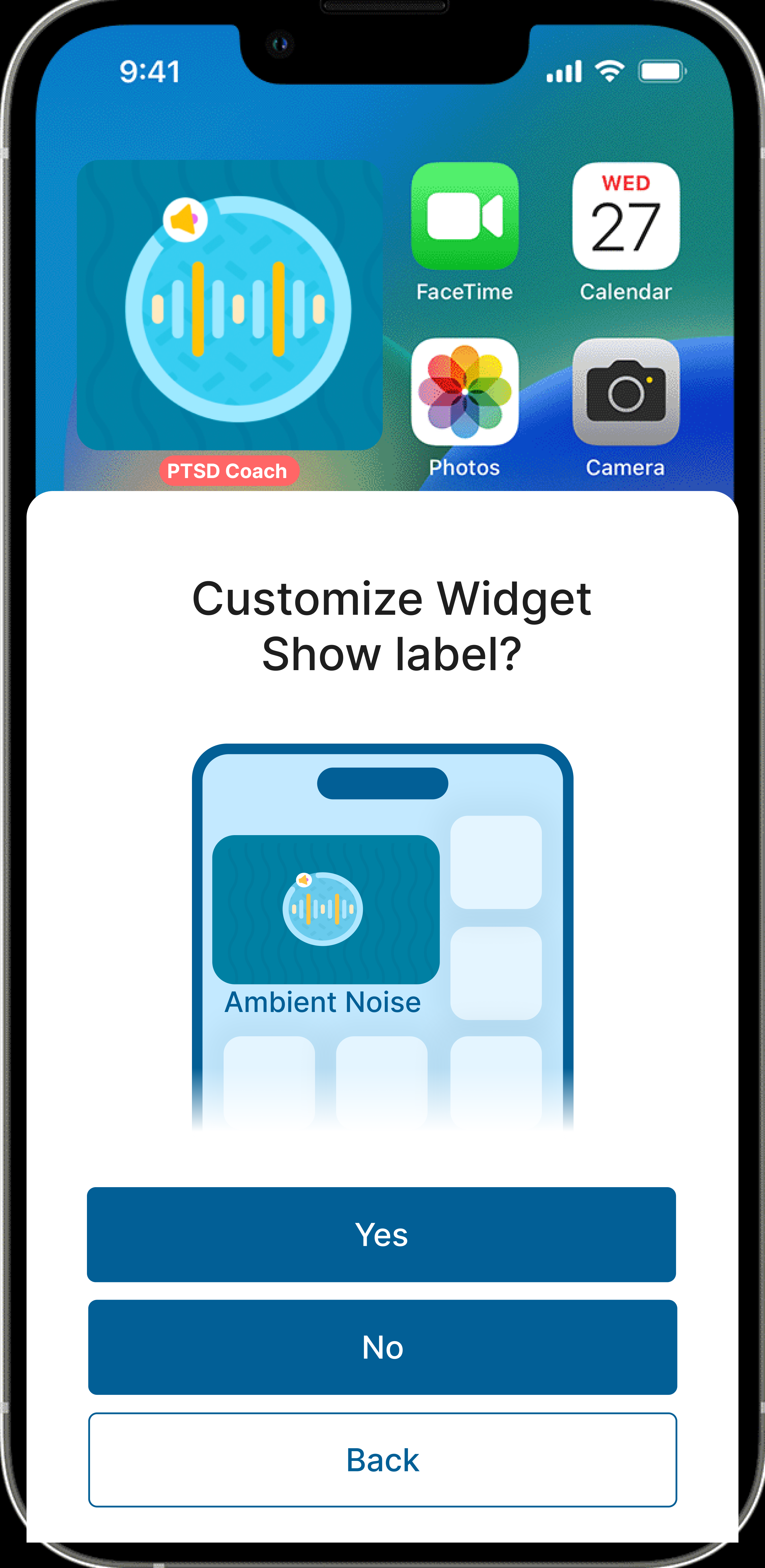
We also designed a home screen widget giving users one-tap access to their favorite tool directly from the lock screen.
Impact
Reflection
This project shaped how I approach every research engagement: the highest-stakes users define the baseline. If a tool works for someone in crisis, it works for everyone. Designing for extremes isn't a constraint — it's a research strategy.
What I'd Do Differently
I'd push for more sessions with veterans who have lower digital literacy earlier in the process. Most participants were relatively comfortable with smartphones, which may have masked some navigation barriers that would surface with a broader user base. I'd also advocate for a longer feedback loop with the clinical team — some of our UX recommendations had implications for therapeutic language that would have benefited from more back-and-forth review before finalization.
What's Next
The NCPTSD team is currently applying the research recommendations to PTSD Coach. Once the updates go live, the plan is to run another round of usability testing with veterans to validate that the changes improved clarity, accessibility, and emotional safety — and to surface any new friction points that emerge from the redesign.